

Imagine walking into a brick-and-mortar store. If the lights are flickering, the layout is confusing, and you can’t instantly tell what they actually sell, you are probably going to turn around and walk right back out. Your website is absolutely no different. In the digital world, you have roughly three seconds to convince a new visitor to stick around.
At Topsia Website Designs, we spend a lot of time analyzing user behavior and mapping out the customer journey. We’ve found that the most critical piece of real estate on your entire website is the “hero section”—the very first area people see before they touch their scroll wheel. If that section isn’t dialed in, the rest of your site doesn’t matter.
Quick friendly disclaimer: Don’t panic if your website’s bounce rate is a little high right now! A few strategic design tweaks can dramatically change how long people stay on your page.
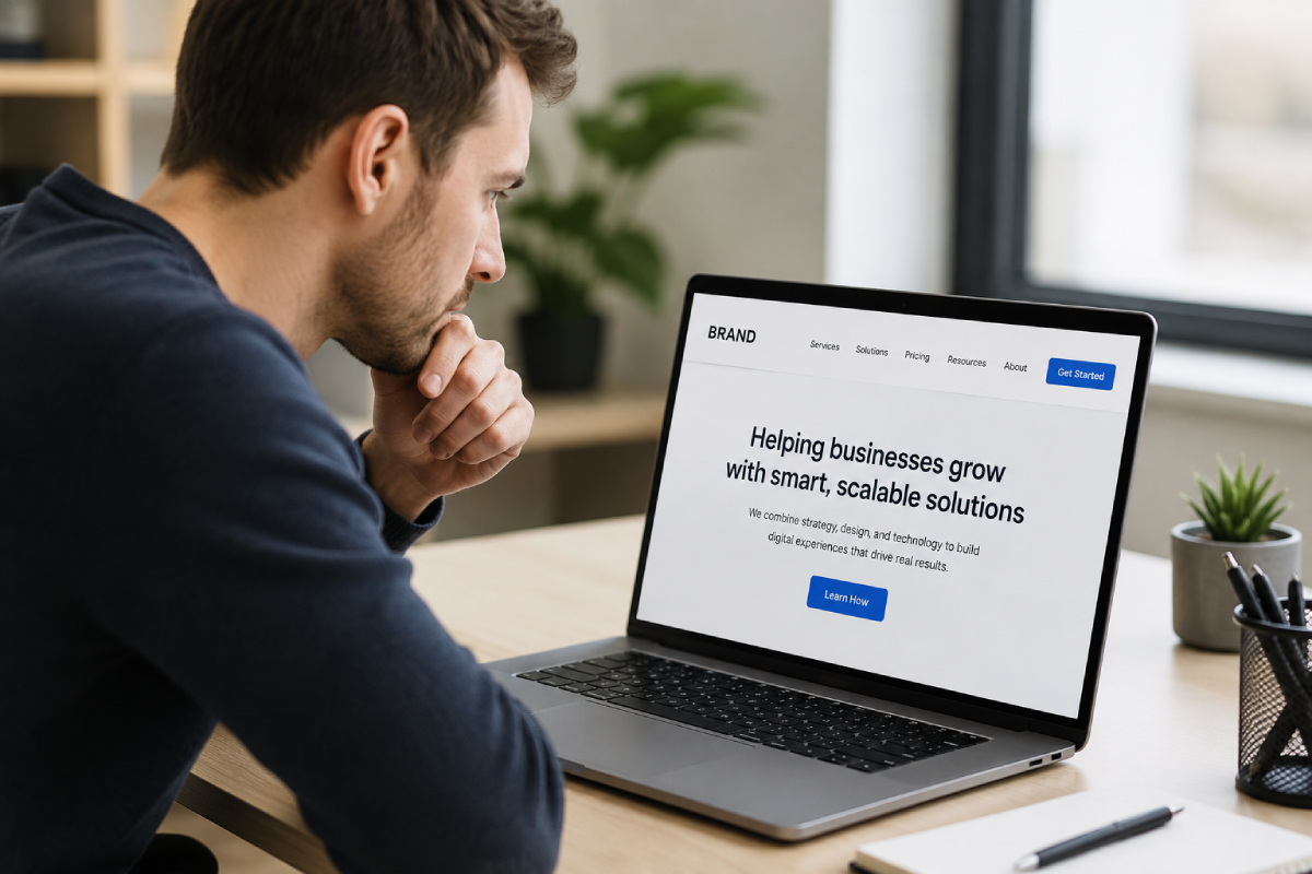
1. The “Clever Over Clear” Headline
Many business owners try to sound overly poetic or corporate in their main headline. If your website says something like, “Empowering Synergistic Solutions for Tomorrow,” your visitors are going to leave because they have zero clue what you actually do.
The quick fix: Apply the “Caveman Test.” Write a headline so incredibly clear that a caveman could understand what you sell, who you sell it to, and why they should care. Save the clever wordplay for your blog.
2. The Generic Stock Photo Trap
We all know the picture: three incredibly attractive people in business suits, smiling at a laptop and shaking hands in a sterile, bright white boardroom. Generic stock photos actively destroy trust because modern consumers crave authenticity. If your imagery looks fake, visitors might assume your business is fake, too.
The quick fix: Swap out the cheesy stock imagery for high-quality, authentic photos of your actual team, your workspace, or your product in action. Even a decent smartphone photo of a real project builds more trust than a polished stock image.
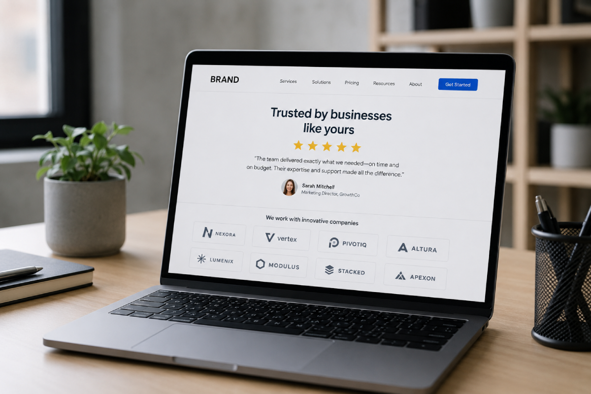
3. Zero Immediate Trust Signals
When someone lands on your site for the first time, their internal defense mechanism is on high alert. They are silently wondering, “Is this company legitimate? Has anyone else actually hired them?” If you wait until the very bottom of the page to show your reviews, you’ve waited too long.
The quick fix: Inject trust immediately. Place a small banner just below your main hero section featuring logos of companies you’ve worked with, or feature a single, powerful 5-star Google review right next to your primary headline.
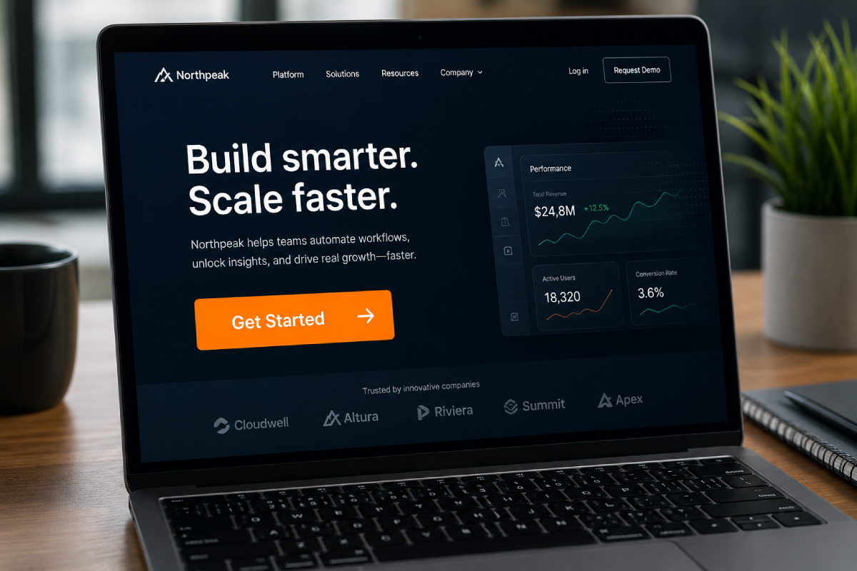
4. A Weak or Missing Next Step
If a visitor likes what they see in those first three seconds, what are they supposed to do next? If they have to scroll up and down trying to figure out how to contact you or buy your product, the friction will cause them to leave.
- Use contrast: Your primary button color should stand out boldly against your background.
- Be specific: Instead of “Learn More,” use action-driven text like “Get Your Free Estimate.”
- Keep it above the fold: Make sure this button is visible immediately when the site loads, without the user needing to scroll.
If your website is failing the 3-second test and you are tired of watching potential clients bounce over to your competitors, drop us a line here at Topsia Website Designs. We specialize in building user experiences that immediately capture attention and drive real business results.
Whether you need a quick refresh of your homepage hero section or a complete custom redesign, we’ve got your back. Reach out today, and let’s start turning your fleeting visitors into loyal customers!


