

You log into Google Analytics and see a steady stream of traffic. People are clicking your ads, finding your social links, and landing on your homepage. But when you check your inbox or your sales dashboard? Crickets. Nothing is more frustrating than putting effort into driving traffic, only to watch those visitors leave without taking action.
At Topsia Website Designs, we see this scenario all the time. Business owners often start second-guessing their pricing or their services. But in our experience, the real culprit is usually “digital friction.” If your website makes it even slightly difficult for someone to figure out what you do or how to hire you, they will bounce to a competitor.
Quick friendly disclaimer: Don’t panic if you spot a few of these mistakes on your own website! They are incredibly common and usually very straightforward to fix.

1. The “Kitchen Sink” Navigation
We get it—your business does a lot, and you want to make sure your visitors know it. But giving your visitors a massive, cluttered navigation menu with 25 different drop-down options doesn’t help them; it paralyzes them. When people are faced with too many choices, they often make no choice at all.
The quick fix: Consolidate your main header menu to 5 to 7 core items. Move secondary links (like your Privacy Policy, FAQs, or minor sub-services) down to your footer.
2. The “Pinch and Zoom” Mobile Experience
Over half of your visitors are browsing on their phones while waiting in line for coffee or sitting on the couch. If they have to pinch, zoom, and scroll sideways just to read a paragraph on your services page, they are going to hit the back button within seconds.
The quick fix: View your website on your own smartphone right now. If buttons are too small to tap with a thumb, or text is illegible, you need to adjust your mobile breakpoints in Elementor immediately.

3. Playing Hide-and-Seek With Your Contact Info
If someone is ready to hand you their money, do not make them work for it. You would be shocked at how many websites bury their phone number at the very bottom of an “About” page or force users to hunt for a contact form.
The quick fix: Put your primary contact method (a phone number or a “Get a Quote” button) in the top-right corner of your header so it is visible on every single page.
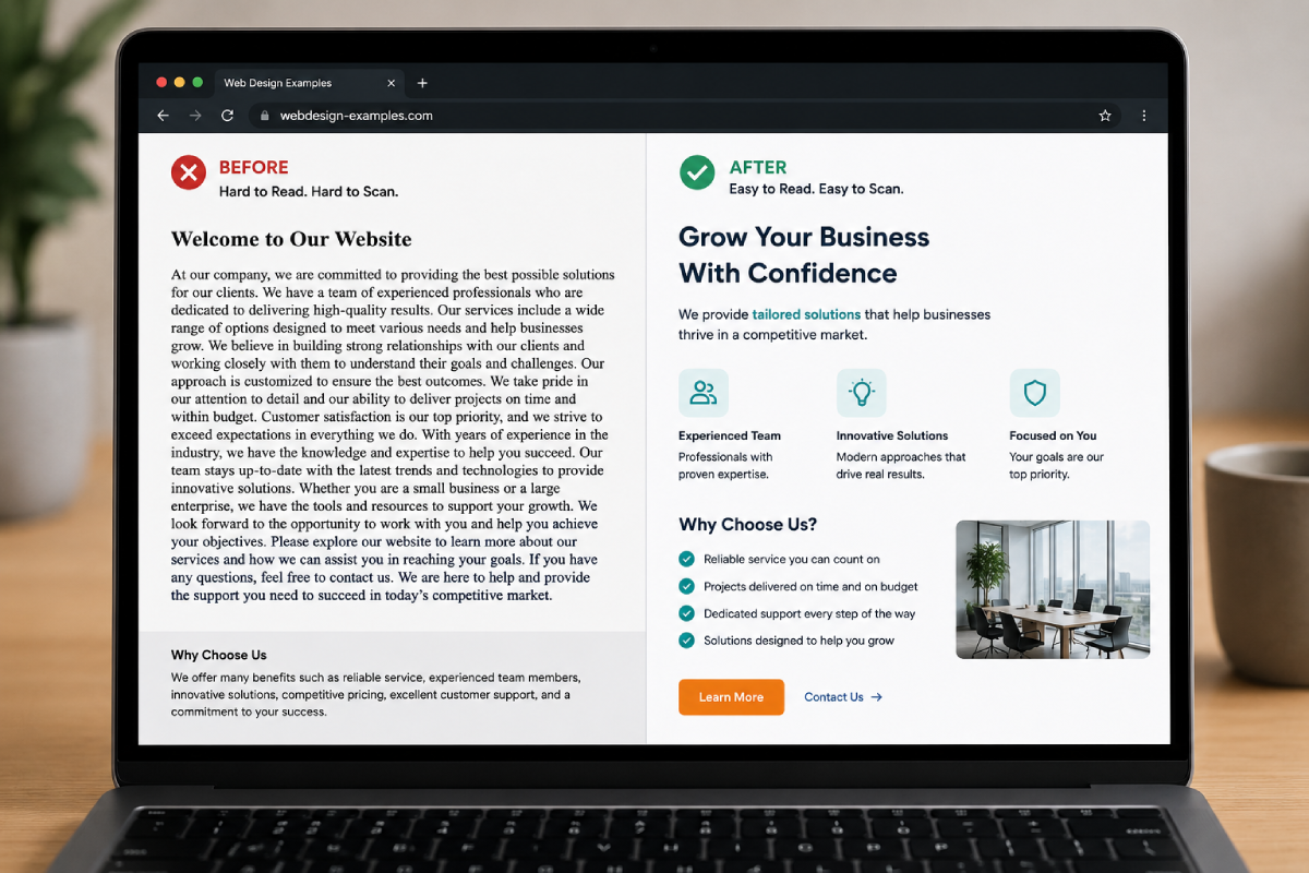
4. Exhausting Walls of Text
You might have written the most compelling sales copy in the world, but if it looks like a page out of a dense college textbook, nobody is reading it. Modern web users don’t read; they skim.
- Break it up: Keep paragraphs to 3 or 4 sentences maximum.
- Use formatting: Rely heavily on bullet points, numbered lists, and bold text to highlight the important parts.
- Add whitespace: Give your content room to breathe by adding margins between sections.
5. Vague, Wimpy Calls-to-Action (CTAs)
A tiny gray button that simply says “Submit” at the bottom of a page isn’t exactly inspiring. Your visitors need clear directions on what to do next, and they need to know what happens when they click.
The quick fix: Use strong, action-oriented verbs. Swap out boring text for phrases like “Schedule Your Free Consultation,” “Download the Guide,” or “Get Your Custom Quote.” Make sure the button color pops against the rest of your design.
If you are tired of watching potential clients slip through the cracks of a poorly optimized website, drop us a line here at Topsia Website Designs. We specialize in building strategic, high-converting websites that do the heavy lifting for your business.
Whether you need a quick UI/UX audit to fix a few glaring mistakes, or a complete website overhaul to start driving real leads, we’ve got your back. Reach out today, and let’s turn your website into your best salesperson!

